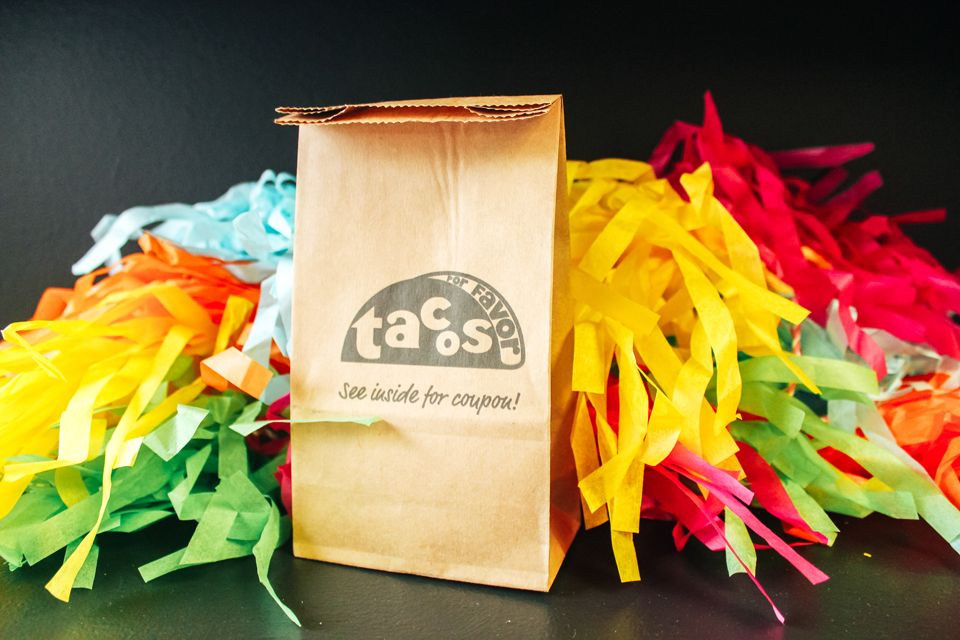
Tacos Por Favor Branding
This project objective was to create a cohesive identity for the local Santa Monica Mexican restaurant Tacos Por Favor, and an experience for the consumer through a mailer.
The Tacos Por Favor philosophy and tagline “We make healthy Mexican food that just taste great!!” has remained true and successful for their business.
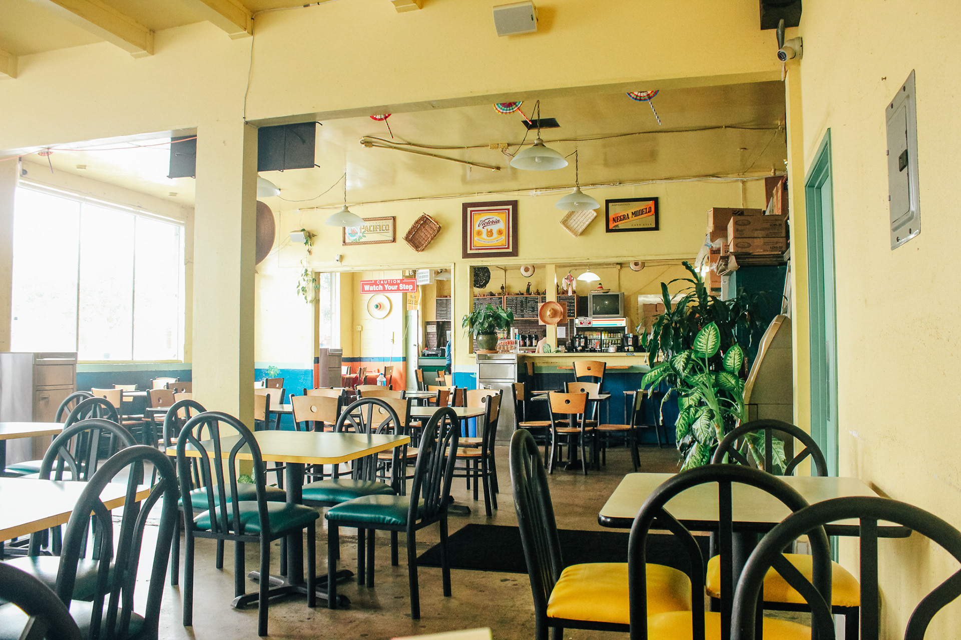
Other than their first restaurant being in a prime location in Santa Monica — catering to a diverse demographic of students from Santa Monica City College, business people, Santa Monica residents, tourists/visitors, families, and more — they also serve food that’s good and well-priced. They’re not trying to be fancy or structured.
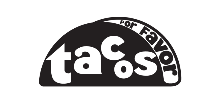
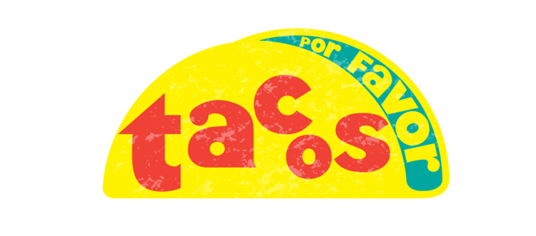
They don’t currently have a logo — when I asked the manager how they chose to design their menu he shrugged his shoulders and said they just typed it out, and the Mexican and American flag on the front of the menu was chosen because the founder just liked it — but they have a consistent atmosphere in their restaurants: casual, preserved, no-frills, and not fancy in any regard.
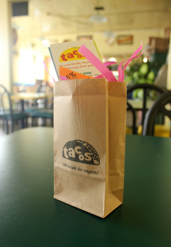
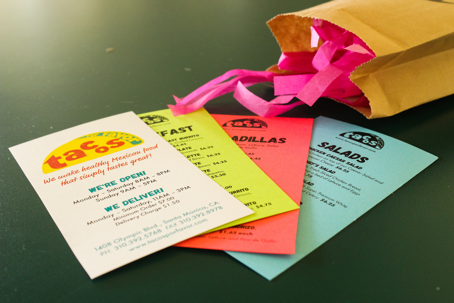
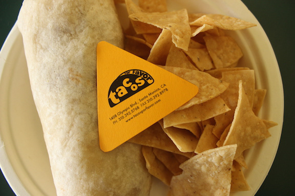
My objective in this assignment was to use some recognizable elements they have and push them to a more unified visual approach that has a casual feel, but bright and fun.
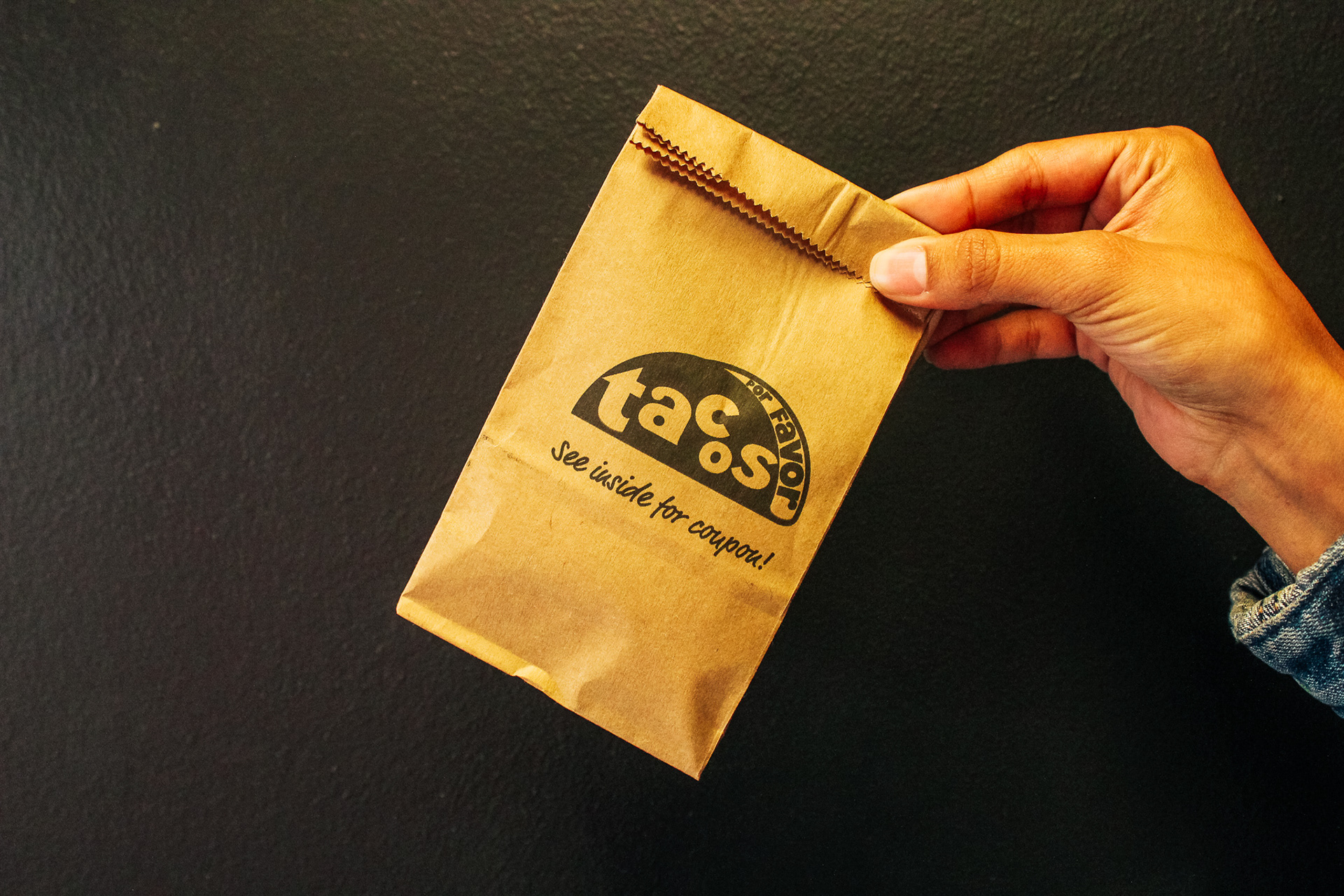
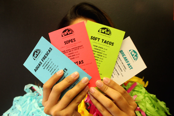
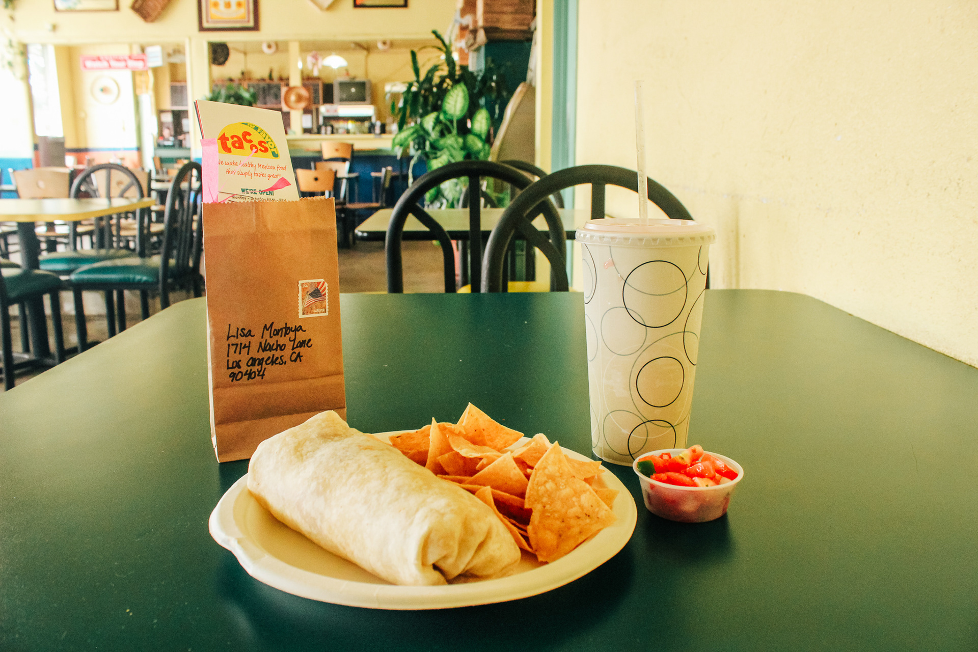
The challenge was to create a visual identity that they could use across all their print materials and web platforms, and also a mailer that was an experience for the consumer to open.
*This was prompted by a school project at UCLA Extension